We have collected a few items from UA Brand Standards for quick reference. Review the full branding standards for more in-depth details of UA’s branding guidelines. And don’t forget to submit required items for divisional approval before submitting for UA brand approval.
Wordmark Usage
There are two different versions of your department’s wordmark. There is an official wordmark with The University of Alabama name in it that is best for events that are used on and off-campus. The script A wordmark is best for inner campus usage. Please remember that the Capstone A version must be accompanied by “The University of Alabama” nameplate if it is being used for anything taking place away from campus.
Official Wordmark
There is an official wordmark with The University of Alabama name in it that is best for events that are used on and off-campus.
Capstone A Wordmark
The Capstone A version must be accompanied with The University of Alabama nameplate.
UA Wordmark Resources
Download the UA nameplate or other University wordmarks in various formats.
SL Wordmarks
Download the main UA and Division of Student Life wordmarks.
Special Wordmarks
Please note that if you have a long department title and you received a special stacked wordmark it is only to be used on promo items or specified t-shirts, pullovers, etc., when needed. Whenever possible, you need to use one of the two main wordmarks.
UAS Campus Alignment Branding
Please add the UAS System logo on any marketing/advertising pieces that are for external audiences. It does not need to be a certain size or location.
Wordmark Update
Should you have any changes please notify Strategic Communications by filling out a Departmental Identifier Request and email Christy or Amy so that they can be up to date on your latest identifier changes.
Reminder- Licensing (TM and R)
Please remember that terms like “Tide” and “Bama“ are protected trademarks of The University of Alabama. Any use of these names, logos, or related imagery must comply with official licensing guidelines. For detailed information, refer to the University’s trademark and logo usage document: Alabama Logos and Trademark Guidelines.
Houndstooth
Houndstooth is permitted to be used sparingly as a design element on printed collateral such as brochures, flyers, postcards, etc. Any use of the pattern on promotional items (shirts, water bottles, etc.) will require approval through UA’s Trademark Licensing Office.
Elephant
“Cartoonish” elephant graphics can be created or used, but they cannot appear to be UA (old or new) Big Al logos that were altered. Elephants must have the trunk angled up and should not bear a resemblance to Big Al. Any former Big Al logos cannot be used. Current Big Al logos cannot be used without permission from Trademark Licensing. All usage of Big Al and other Athletic-related marks must be approved by the Trademark Licensing Office within the Athletic Department. Departments on campus should request permission in advance to use Big Al through the director of Brand Strategy at brandapproval@ua.edu.
There are approved elephants for use.
UAS Campus Alignment Branding
In an effort to raise the brand awareness of the University of Alabama System, all external advertising and promotional materials must carry one of the logos listed below, beginning August 2020. This policy covers all advertising and promotional material, including print, video, sports programs, audio, whether paid or internally generated. Please review the UAS Campus Brand Alignment Guide for more information and examples of how to utilize the logos in marketing materials. The logo must be legible on all items, and as of June 2023, the one-line version of the logo is no longer allowed.
Approved fonts
Official UA Typefaces/Fonts: Minion Pro and Trade Gothic
If you need access to these fonts please email us.
Approved Colors
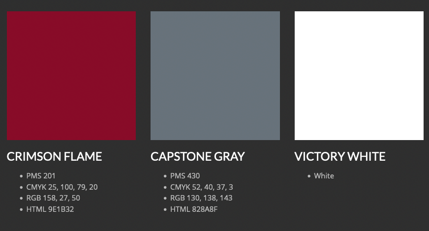
Primary UA Colors
Pantone 201 #9E1B32, Pantone 430 #828A8F and White

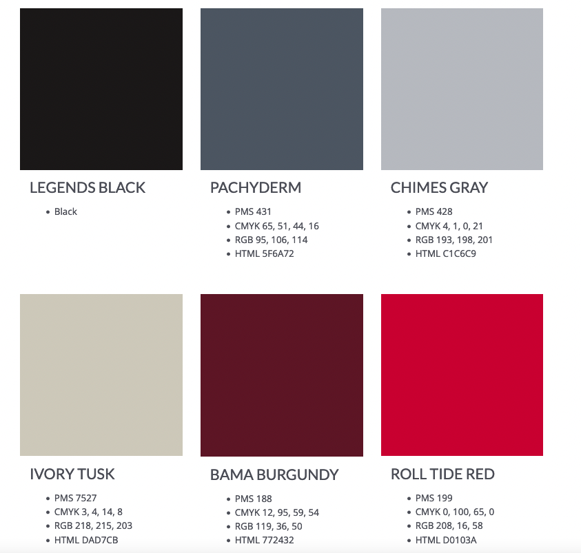
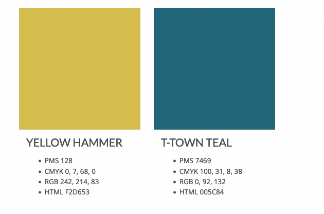
Secondary Colors
The secondary color palette was created to provide additional creative inspiration. The colors should be used sparingly and must not exceed 20% of the total color palette of any design. The colors should complement the design and are best utilized when needed for variety such as in infographics, charts and icons for long-form marketing collateral.
Tips for secondary colors:
- Black should not be used as a primary color element.
- Do not use secondary colors, other than black, for UA logos.
- Secondary colors are not approved for use as a prominent, signifying color for a college, division, center, institute, department, etc.
- Tints and shades of the colors are prohibited.

